

Occasional news from Signal Type Foundry
#2 | March 2025 |
|---|
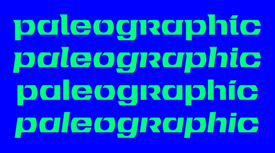
Field Italics (Finally)
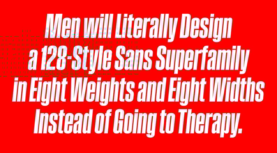
I launched Field Gothic back in 2022. It went from absurdly narrow to insufferably wide, from barely visible to vantablack, with a few relatively normal styles along the way, and it all added up to 64 styles, which was apparently not enough to fill the aching void inside me. So this year, instead of taking a good, hard look at my choices in life, I’ve just doubled down and, with the help of the estimable Sebastian Carewe, added matching italics. And now it’s 128 styles, and I’m sure I’ll be happy at last. Don’t you agree? →
National Museum of Ireland Logo
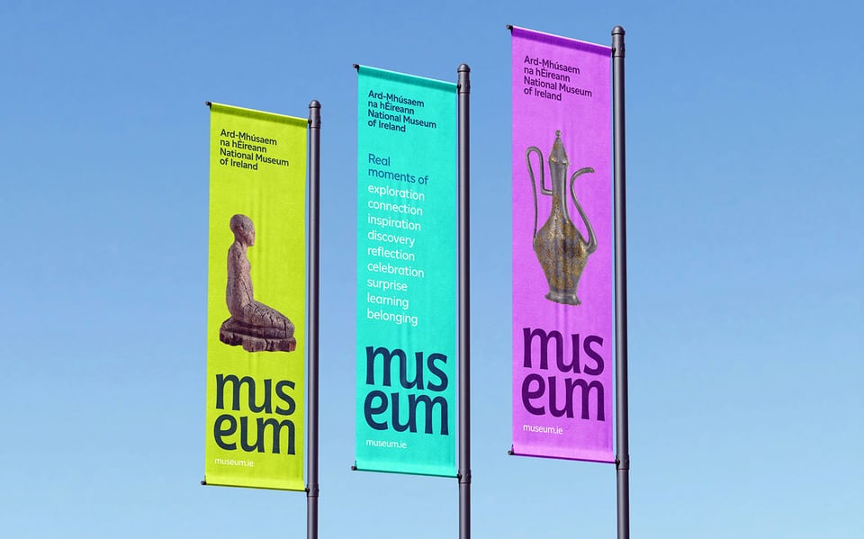
It’s a little nervous-making when you’re asked to rework a beloved 30-year-old logo for a beloved national institution. It makes things easier when the guy who hired you to do it is the guy who originally designed it: Ciarán ÓGaora at Zero-G. I worked with Ciarán and Jason Delahunty to gently, respectfully update an Irish design classic as part of a comprehensive brand refresh for the National Museum of Ireland. I think it came out pretty good. What do you think? →
Tailte Éireann Bicentennial Stamp
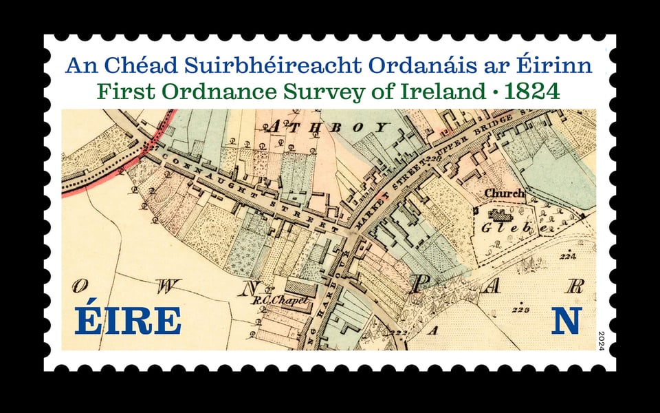
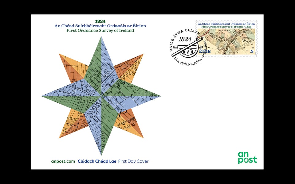
Nice to see my stamp for An Post out in the world, commemorating 200 years since the first Ordnance Survey of Ireland. Many thanks to the lovely people at Tailte Éireann who tirelessly dug through their map archives for me and made high-quality custom scans. The cancellation stamp was fun to draw, too: that’s an antique brass graphometer. This was the first outing for our own Reckham, and still one of our favorites.
Jarlath
After a mortifyingly long time in beta, we’ve finally released Jarlath, my digital revival of Jarlath Hayes’s 1974 Tuam Uncial, a dry-transfer icon of Irish Modernism. Hayes’s original design was based on hacked Helvetica Bold. He sliced off the tops and bottoms of the letters to produce forms reminiscent of the wide, pen-formed scripts of old Insular texts. The revival, designed under the supervision of Hayes’s daughter, supports over 150 languages and features ligatures, directional arrows, a fuller range of punctuation, and italic, sans, and sans italic variants. Have a look. →
Umbel Branding
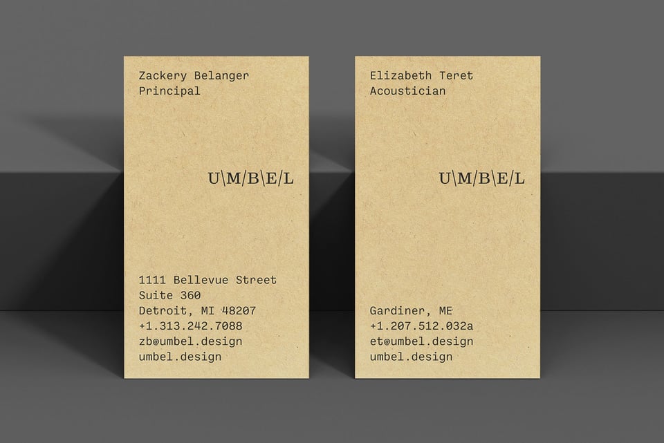
We were asked to do branding for Umbel, a new Detroit-based acoustics studio that “approaches acoustics through the lens of shape.” The mark is created entirely of typographic elements, and can be typed at a keyboard; slashes and backslashes represent sound waves. Type palette based on our own Reckham and Ballinger Mono typefaces. More here. →

You just read issue #2 of Noise. You can also browse the full archives of this newsletter.