

Occasional news from Signal Type Foundry
#4 | March 2026 |
|---|
24 + 24 = 48
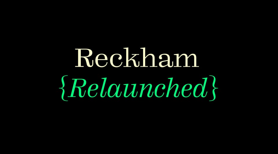
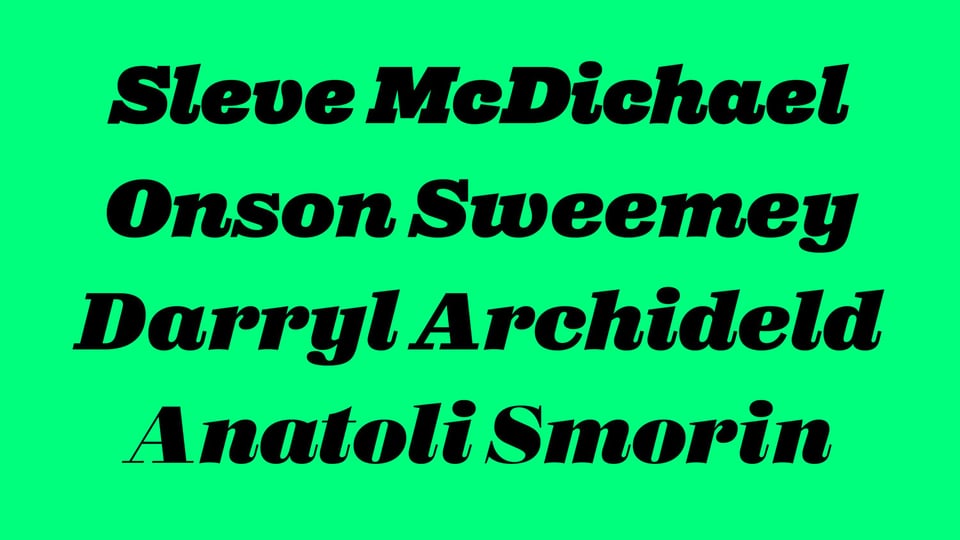
When we published our mutant Scotch roman back in 2023, we knew we weren't done yet. We wanted matching italics for all 24 styles, as well as small caps, tabular and oldstyle figures, superiors and inferiors, and all the other features you want to make a text/display face fit for proper book design. And we wanted them to both play nicely with the romans and have their own personalities. It took a bit longer than we’d planned, but we got there eventually. Have a look and tell us what you think. →
Fíon Eile

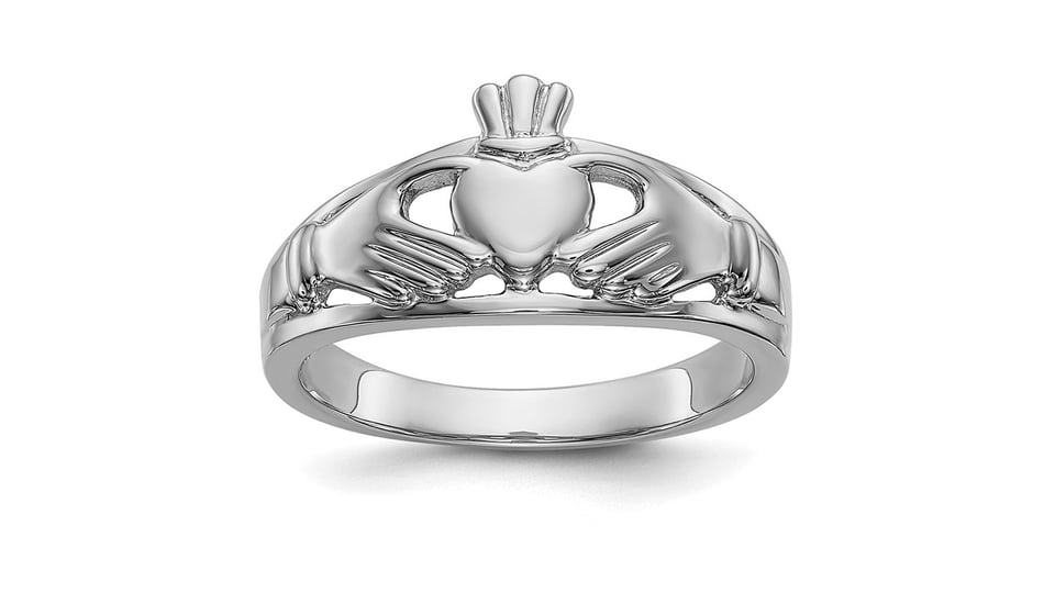
The smallest jobs are sometimes the most fun. Fíon Eile (Irish for ‘Another Wine’) opened in the North Dublin neighborhood of Phibsboro “to make high-quality, responsibly made wine accessible to everyone.” Seán Mongey and the team at Post Studio asked me to draw their logo, a vinous play on a classic bit of Gaelic kitsch: the claddagh ring. They warned me they planned to make the logo tiny, but type designers are used to drawing tiny things. Concept and branding by Post. Vector wrangling by me. A good time was had by all. Next time you’re on the North Circular Road, stop by and treat yourself to a bottle.
Kneecap & Field Gothic
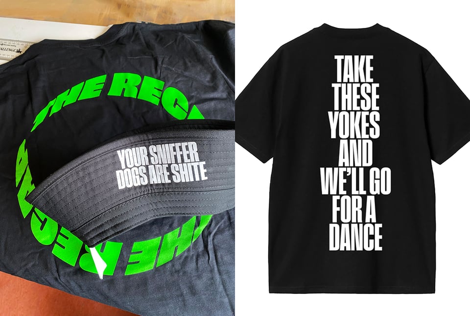
Type design is full of surprises. Apparently our Field Gothic has become the official merch face of Irish hip-hop group Kneecap. Howyeh, Liam, Naoise, and J.J. Thanks for thinking of us. More Field Gothic here.→
Digbeth & Field Gothic
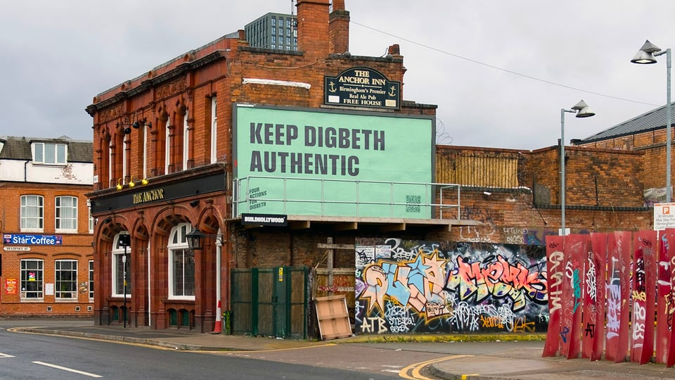
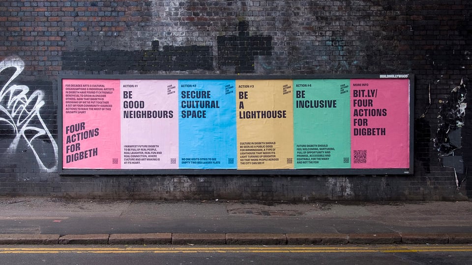
More socially-engaged Field Gothic, this time from the brilliant (and Digbeth-based) Keith Dodds: an identity and poster campaign for Four Actions For Digbeth, a community-led plan to secure the future of Birmingham’s creative quarter. The project was led by Grand Union and EASTSIDE PROJECTS LIMITED, who worked with Keith Dodds Studio to create a typographic identity, a launch campaign, and a publication to introduce the plan.
Thalo
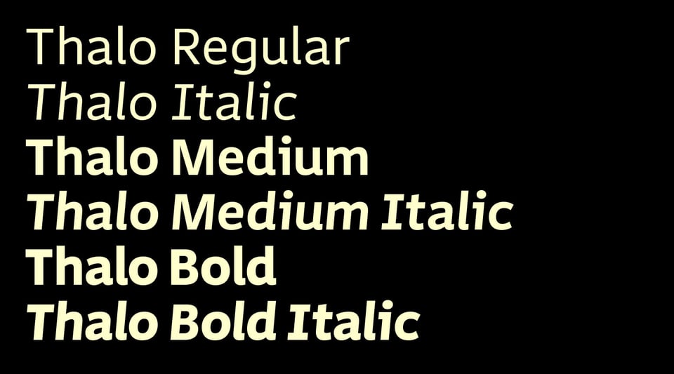
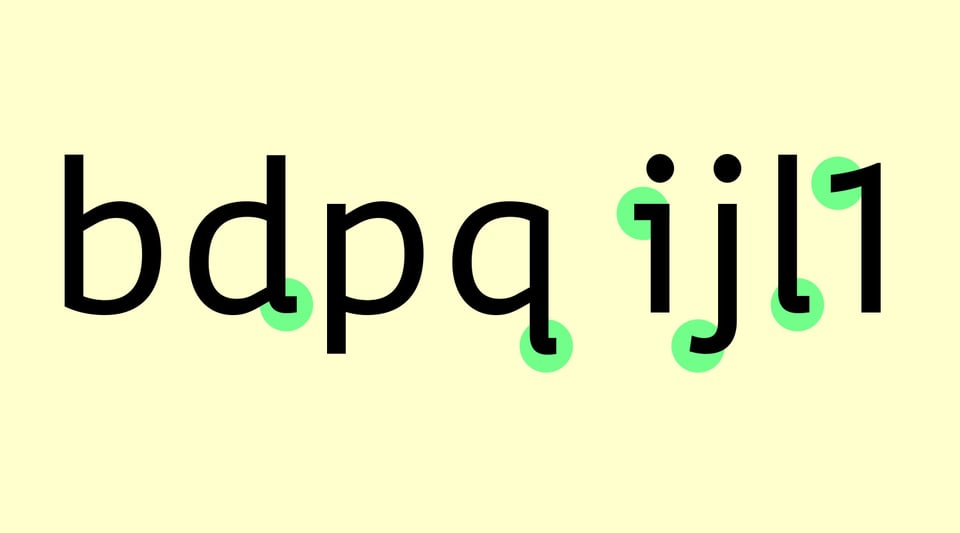
Originally commissioned for a state transportation agency as a fully accessible typeface for signage and timetables, Thalo is a six-style humanist sans that employs best design practices to support dyslexic and other reading-challenged populations. We kept the contrast low to increase visual cohesion within glyphs. Counters, apertures, letterspacing, and x-height are generous but not extreme. ‘Flippable’ etters like b, d, p, and q were carefully drawn to avoid dyslexic ‘mirror invariance’; bowls are asymmetrical for the same reason. We'll have a case study up soon and release all six styles commercially later this year.

You just read issue #4 of Noise. You can also browse the full archives of this newsletter.